Your credit card landing page isn’t just a destination, it’s the gateway to conversion. In today’s fast-paced, mobile-centric world, every view and click counts. A poorly designed page risks wasting your card advertising efforts and losing potential customers.
But with the right approach, your credit card landing page can capture attention, build trust, and drive action. Here’s how to design a high-converting credit card landing page that delivers results.
Understand the user journey
Successful credit card advertising begins with a deep understanding of the user journey. Your marketing efforts must match the user’s mindset at every stage. As users follow your marketing trail, it should smoothly guide them from curiosity to conversion, anticipating needs and eliminating friction. A well-designed landing page transforms attention into action, paying off your entire marketing strategy.
PRO TIPS
Match user intent: ensure that the landing page aligns with the expectations set by your ads or campaigns.
Guide users smoothly: the page should anticipate next steps, making the application process intuitive.
Optimize user experience (UX)
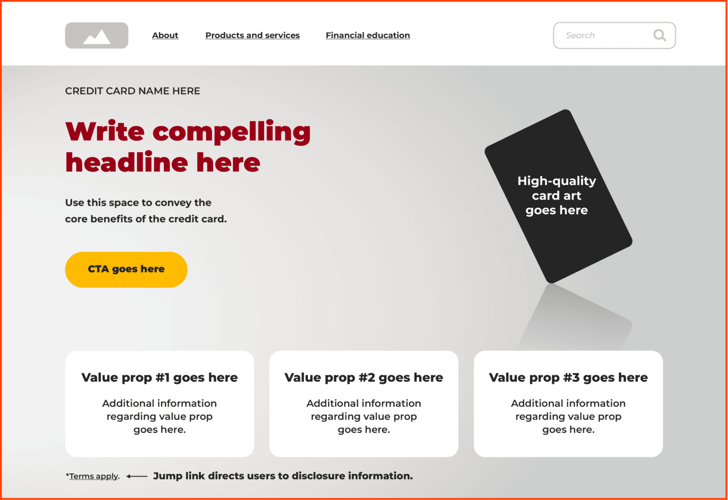
A high-converting landing page guides users through a frictionless and intuitive decision-making process. Best practices include:
- Above-the-fold impact
Use the prime space on the page to effortlessly guide users from curiosity to conversion. - Visual appeal
High-quality images of the credit card itself help visitors visualize owning it. Lifestyle images that align with your target customer’s aspirations can yield great results. - Compelling headlines
Use straightforward language that immediately conveys the core benefit of the credit card. - Clear, actionable CTAs
Use direct language. Place multiple CTAs strategically throughout the page. Ensure CTA buttons stand out with bold colors and appropriate sizing. - Highlight value propositions
Emphasize rewards, perks, and differentiators in order of importance. - Compliance management
Integrate necessary legal and regulatory content without disrupting the flow.

Design for mobile
With the majority of banking interactions now taking place on mobile, responsiveness is non-negotiable. Between 2019 and 2023, mobile banking saw a 127% increase in customer interactions.
McKinsey & Company, Mobile Money Matters, August 2024.
To ensure your landing page is fully optimized for mobile users, focus on:
- Fast load times
Speed is crucial for retention, slow pages lead to higher bounce rates. - Responsive design
Ensure your website looks and functions smoothly on all screen sizes. - Dark mode compatibility
A rising user preference, especially on mobile devices, integrating dark mode ensures a more comfortable user experience, specifically in low-light environments. - Streamlined forms
Simplify form fields by minimizing required inputs and using autofill options for increased user convenience.
Build trust with credibility signals
Financial decisions are highly sensitive. To ensure users feel secure sharing their financial information, integrate trust-building elements into your landing page:
- Customer testimonials
Real stories of satisfaction and success from actual users. - Collapsible FAQ section
Questions displayed as titles with answers revealed once clicked for transparently addressing common concerns without cluttering the page. - Security badges
Display visual security cues and explain your data protection measures. - Partnerships logos
Highlight trusted affiliations, such as “Member FDIC” or partnerships with reputable financial institutions.
Optional enhancements
For an even more dynamic user experience, consider:
- Personalization
Tailor offers or recommendations based on user data. - A/B testing
Continuously refine design elements and messaging through iterative testing to optimize conversion rates.
Reduce friction in the path to conversion
Even the best campaign will fail if the landing page is confusing or frustrating. Behavioral inertia and status quo bias can deter action, but a well-designed page uses these strategies to prevent these barriers.
By making the process intuitive and frictionless, you help users build momentum toward action rather than giving them reasons to hesitate. Eliminating confusion keeps users clearly on the path and avoids unnecessary steps or clutter.
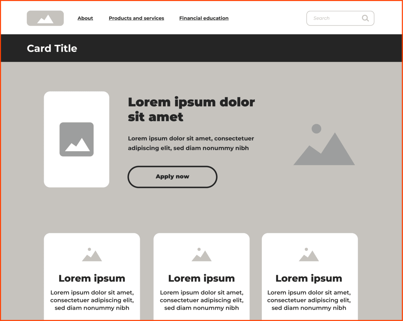
For instance, we like to start the design process with low-fidelity wireframes, which allows us flexibility to incorporate best practices while optimizing pages.

Encourage activation and ongoing use
Turning hesitant leads into engaged cardholders requires more than just conversion. Activation doesn’t end when a user clicks “Apply Now”; it’s critical to keep the momentum going. Your landing page plays a crucial role in this process by setting the tone for the entire user experience and guiding them through the next steps. Encourage ongoing engagement with strategies such as:
- Ease of use
Ensure the landing page is clear and straightforward, simplifying the process with quick calls to action like “Apply Now, Approval in 60 Seconds,” so users can easily understand the next steps. - Create urgency
Use the landing page to communicate time-sensitive offers, such as “Activate by X/X to earn a $20 bonus,” encouraging users to act quickly and complete the activation process. - Leverage social proof
Highlight testimonials or case studies directly on the landing page, illustrating positive experiences and benefits of card usage, which help build trust and nudge users toward taking action.
By optimizing your credit card landing page to support these strategies, you provide users with a clear, motivating path from application to activation, setting a strong foundation for long-term engagement.
Read our article on effective card activation for a deeper dive into helping cardholders overcome their psychological barriers.
By integrating these best practices into your credit card landing page design, you can create a powerful conversion tool. A well-designed page grabs attention with attractive credit card images and enticing offers. Its layout builds trust, encourages action, and turns curious visitors into loyal customers. This helps your credit card marketing strategy get the best return on investment, boosts short-term sales, and builds long-term customer loyalty.

Take your card marketing to the next level
READ THE GUIDE


