Designers are a bit of a strange breed; believe us, we know.
Sometimes it can seem like we speak a completely different language and we obsess over things that nobody else would ever notice, at least not consciously. However, many of these details that are so important to us are what takes a layout from being just okay to feeling finished and professional.
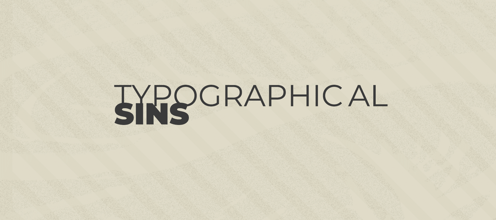
An area that’s particularly precious to designers is the practice setting of type; or Typography.
With terms like widows and orphans typography, rivers, and kerning, it can sound more like we’re talking about social work or geography; not how text has been laid out on a page. Below is a bit of a primer for understanding a designer when they start to rant about how bad the type looks in a magazine ad.
Widows
If you stroll through the studio area of an advertising firm, you might hear an Art Director holler out “Gah! I hate widows!” or you might hear a Creative Director tell a Graphic designer “That layout looks nice, but make sure you kill those widows.” Don’t worry, we’re not heartless jerks. We all care deeply for everyone in need and make sure to call our Grandmas on a regular basis. What we’re talking about is how a paragraph of text flows within a column.
Often, when laying out a block of text, a paragraph will by default end up with one single word left stranded all by it’s lonesome on the last line of the paragraph. This is what we refer to as a widow.
Those poor little words are left barely hanging on to the end of the paragraph, out in the cold, with no one to keep them company. Also, they leave large, awkward blank spaces between paragraphs and make our layouts feel less balanced and cohesive. We much prefer to pull them back up with the rest of their family or to push a few more words down onto the last line with them so they aren’t quite so lonely.
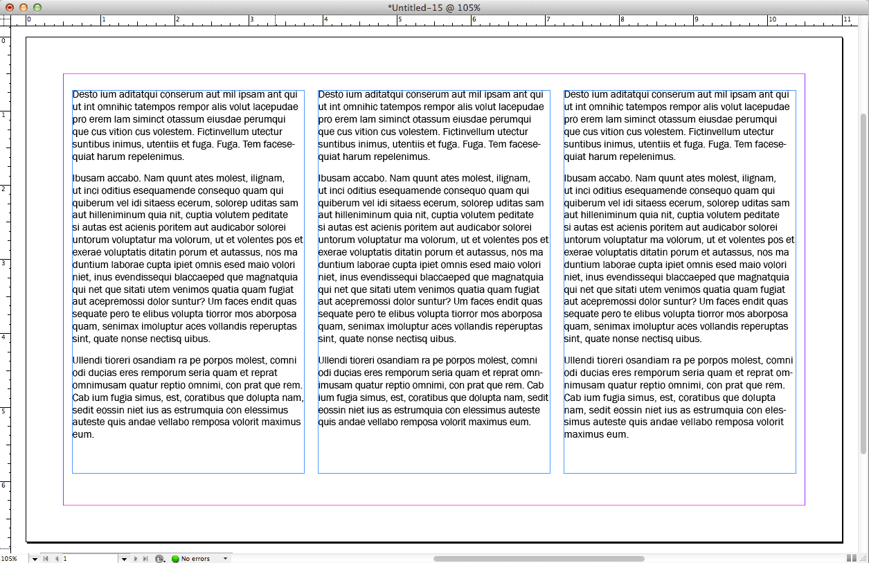
Some designers even go so far as to not to have only two short words alone on the last line. After all, we all know that two is the loneliest number since the number one.
Orphans
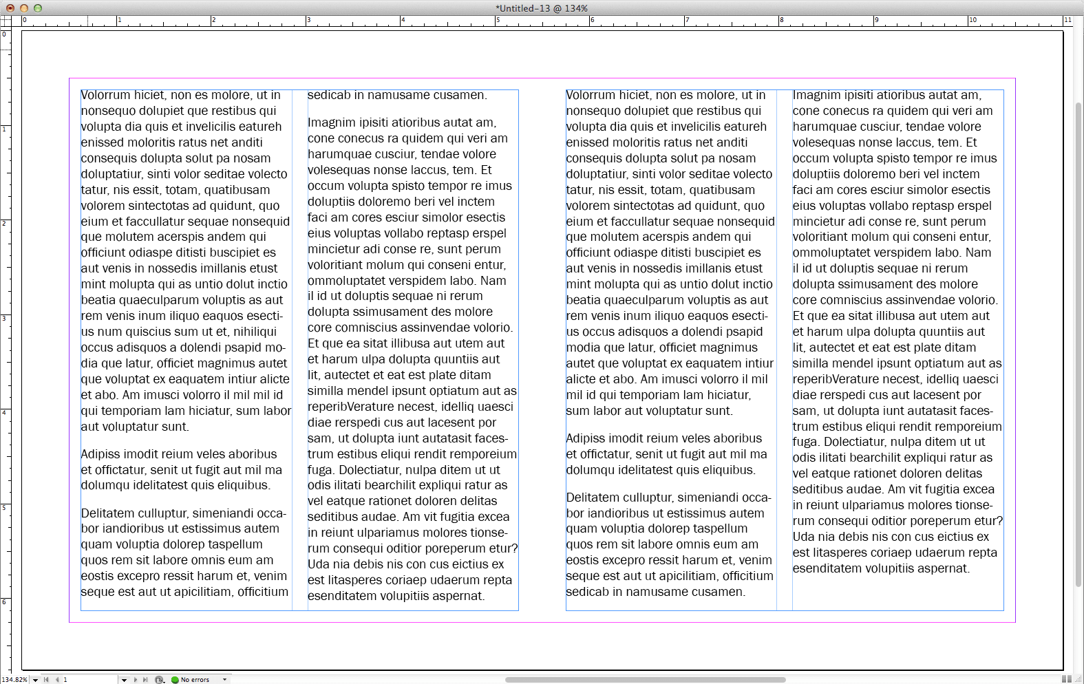
Less common than widows are the dreaded orphans. An orphan occurs when a paragraph of copy doesn’t quite fit completely in one column of text and the very last line flows over into the next column. Orphans can require a bit more work to take care of than widows. After all, they’re still growing and can really pack away the vittles.
Depending on the constraints of a layout, orphans can be as simple to take care of as extending the length of the first column to make room. However, if this isn’t an option, it can sometimes require drastic measures, such as rewriting copy, to get an orphan back into the company of its caring family.
Kerning
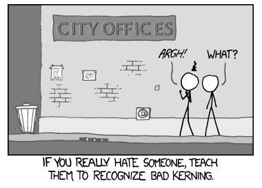
And now we come to the most sneaky villain of typography that all designers love to hate. Usually seen in headlines or within the word mark of a logo, poor kerning can completely ruin a layout and cause it to say something drastically different than what is intended.
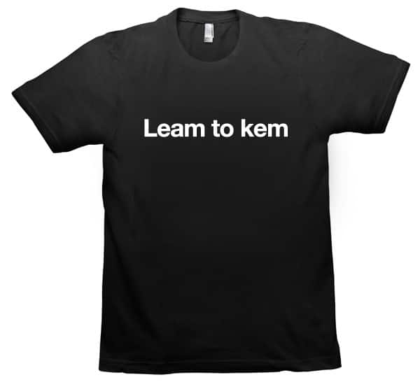
Kerning refers to the space in between individual letters within a word. Certain letters have a long history of not liking each other very much, so they don’t like to get very close. This can leave awkward gaps in your words or even cause them to read as two separate words entirely.
Other letters have a borderline inappropriate level of attraction and if they get too close will appear to combine and become other letters. Some couples that are notorious for being clingy are “r” and “n” as well as “c” and “L” and “I”. Keep an eye out for that last one. Typography errors like this can really ruin your day.
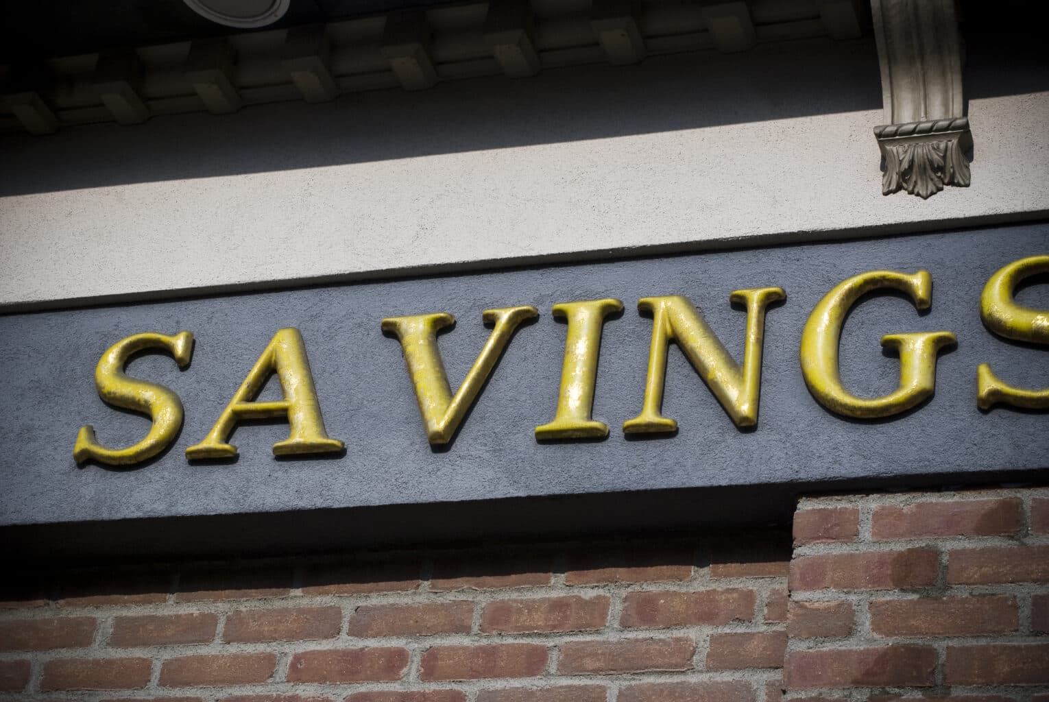
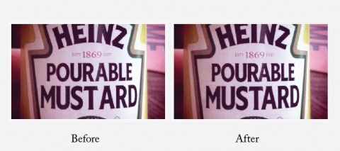
When designing logos or typesetting headlines, it’s critically important to keep a close eye on the kerning. If you aren’t careful, poor kerning will creep in, leave you with a ruined design that goes unnoticed until it’s too late.
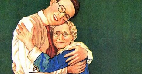
Have You Hugged Your Designer Today?
So this concludes our little tour into the world of Typography. Unfortunately, we didn’t have time to delve into the mysteries of tracking, leading, or rivers. And don’t get us started on hanging punctuation, x-heights, or drop caps.
Like we said, we know we can be a little unusual, but if you want to avoid having the designer in your life fly off the handle in a fit of typographic rage, care for the widows and orphans. And please, for the love of Pete, learn to kern.
Heck, if learning to kern and correctly modify widows and orphans isn’t your cup of tea, you’re in luck. We brew that cup daily and would love to help you. Contact us to start your beautifully written journey.
Insight Written by the Brand Team
Richard Abbott, Chief Experience Officer
Meet our Brand Team—a group of storytellers, artists, and visionaries. Our writers, designers, videographers, and creative directors work together to create compelling narratives and visual identities. They bring brands to life, making sure every message resonates with your audience and leaves a lasting impression.